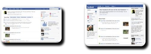
Facebook’s contemporary face

Here are the facts:
- Facebook introduced a complete makeover of its website design some seven weeks ago. The new design relies heavily on AJAX. Which is the technology that makes webpages “dynamic”, i.e., information on these pages changes without requiring a complete reload, just like in Gmail.
- Currently, users are being given a choice to choose between the old and the new designs. But this liberty is set to be scrapped soon.
- Inertia of the masses, desire to preserve status quo, confusion over the new interface; for whatever possible reason, quite a lot of people (close to a million according to BBC — 1% of the entire user base — even though I couldn’t find any such group myself) are really p***** off about the new design.
- The new design itself can be summed up in two words: buggy & promising.
When Orkut did something similar a few months back, I was visibly annoyed. This time, I actually think the change can be for good as Facebook actually improved their experience with AJAX. Orkut’s redesign was merely the old one loading dynamically. To the end user, the difference was largely unnoticeable (evident from the fact that no one even bothered to complain about it). Facebook’s redesign, on the other hand, is a complete revamp of the end-user experience. Here’s a list of stuff that was refined as I see it:
- The profiles are less bloated now because of the clutter being divided into separate tabs now. I unreservedly despise profiles which contain 200 applications. Obtuse folks like this … :

“I have so many applications I can make you feel like you’re living in the 90’s despite being on broadband. If you’re on dialup, go kill yourself. And oh, by the way, I need to get a life.”
… are properly taken care of in the new interface. On a side note, it is entirely plausible that decent profiles is exactly what makes some people react against the new Facebook.
- The comments on Wall posts appear instantaneously when you click the Post button. This is in contrast with Orkut’s AJAX-ified interface where you still have to wait for the whole page to reload.
- And if you are so insistent on checking all the tabs of a profile, again, it won’t require a full reload of the page.
The interface is still buggy, yesterday night I couldn’t navigate as all the links started mysteriously appending to my current address in the address bar. In preliminary days of the new design, even basic stuff like tabs didn’t work properly. Nevertheless, the initial premises are, as I said before, promising. The bugs are getting fixed and at least they got the basic idea of an AJAX-ified interface right.
Tags: AJAX, Design, Facebook, Orkut, Social Networking, Technology, Web, Web 2.0“Everything is in a state of flux, including the status quo.” — Robert Byrne


